IHSAA
“Might as well update the UI while we’re in there.”
How a backend rewrite turned into a full UX audit.
- Client
- Indiana High School Athletic Association
- Role
- Solo designer, with 2 developers and QA
- Platform
- Enterprise web, desktop-first
- Timeline
- 8 months
What is the Indiana High School Athletic Association (IHSAA)?
Ever played a high school sport before? Chances are your coaches had to register your team with a state organization like IHSAA.
The IHSAA is a voluntary, non-profit organization that oversees, supervises, and regulates interscholastic athletic programs for high schools across Indiana.
The project.
IHSAA’s system was built in 2017, and it was due for a rewrite. With more than 50 interconnected pages getting rebuilt anyway, the thinking was: might as well update the UI while we’re in there. Except any good designer knows that UI is only half the equation. UX was bound to come into play eventually, and it took about a day before we couldn’t help but open that can of worms.
What was once “out of sight, out of mind” started to haunt all of us.
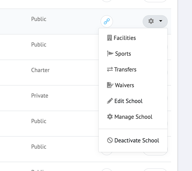
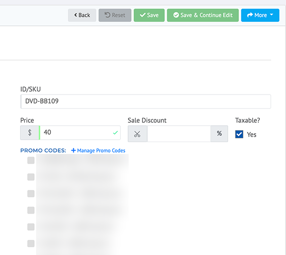
I started asking what a button did, or why a dashboard was one long scrolling page of widgets. The answers were usually some version of “I don’t know” or “we just had to put it somewhere.” Low-hanging fruit turned into medium-hanging fruit turned into a lot of fruit.
Devising a plan.
Only touch the most important pages.
The client helped narrow it down: which pages needed the most love, and which had drawn the most complaints since the 2017 build. We landed mostly on internal pages. The low-traffic public site was mostly reached through deep links, not navigation, so it didn’t need the same attention.
Create reusable components.
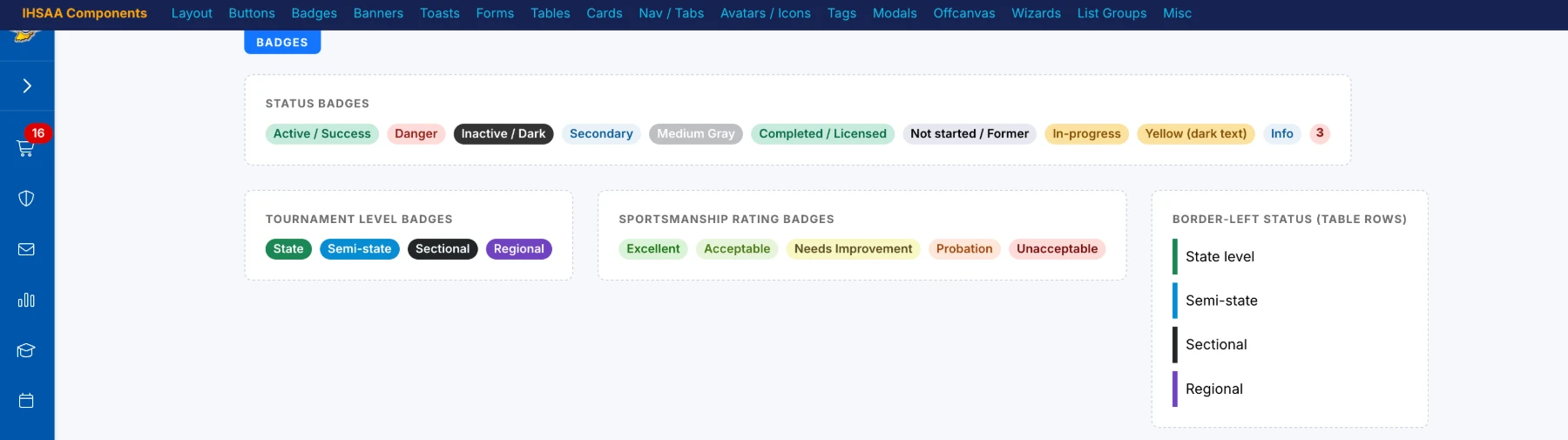
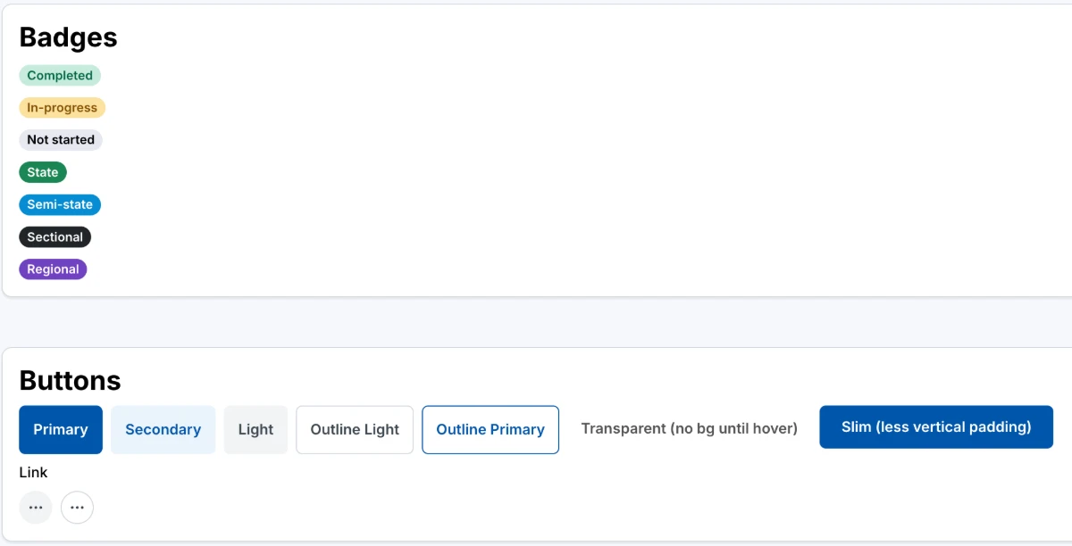
The developers asked for a page of reusable HTML components: form fields, tables, buttons, modals. Design systems weren’t standard practice where I worked, so this was my first real introduction to building one.
Asking 1000 questions.
I had the two original developers and a client who used the system daily to answer every question I had. Sprint by sprint, feature by feature, I asked:
- Tell me about this feature. What’s it for? Who uses it?
- Where do you think it could be improved?
- Is there anything you like about it that you want to keep? (The answer to this one was often no.)
Together we were able to decode years-old decisions and isolate business rules, building a foundation I could rebuild the feature from.
A pattern that traveled where it shouldn’t have.
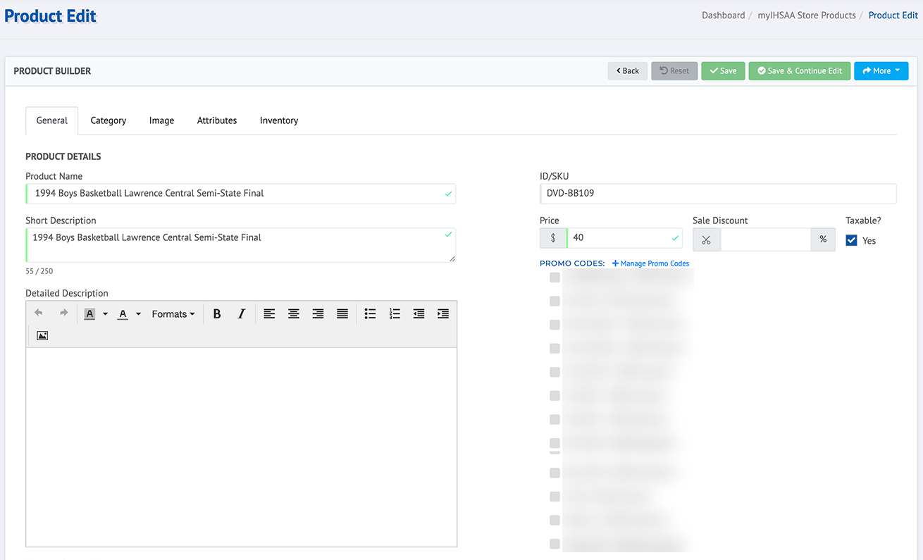
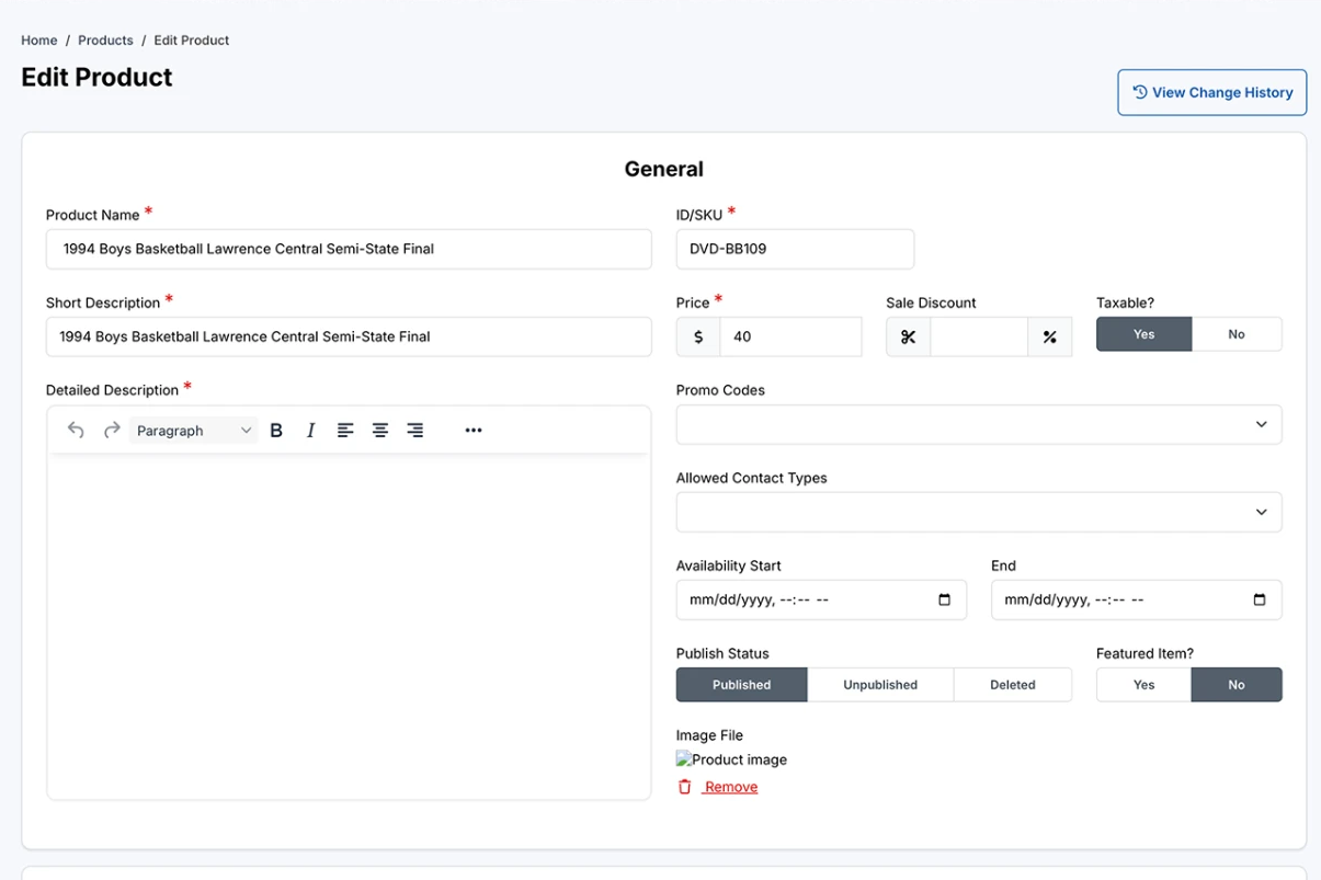
I’d built a tabs-to-cards pattern to solve a specific problem: a form with only a few tabs, where I needed to conditionally show and hide steps as someone filled it out. It worked well there. Without documentation on when to use it, the pattern got picked up elsewhere, turning an unrelated tabbed wizard into a long scrolling page of cards with a single save button at the bottom. It solved a problem that page never had.
Before
After
One I had to let go of.
Saving what someone searched, so hitting back after clicking into a result would return them to where they left off. It would have meant changing how URL routing worked across every search page in the system, which was more than the team could take on. It’s still sitting in my design dreams backlog, waiting for the right moment.
Most improved pages.
Before
After
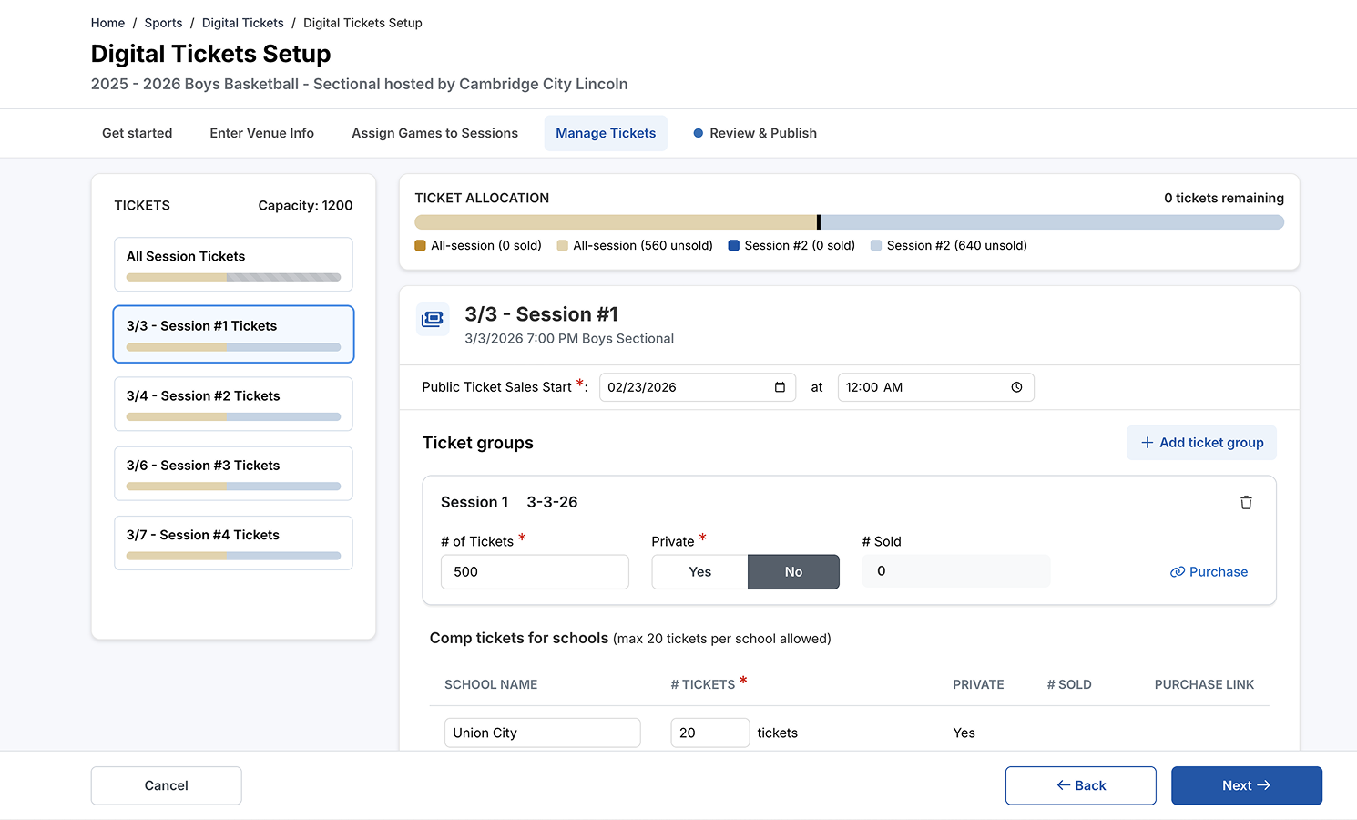
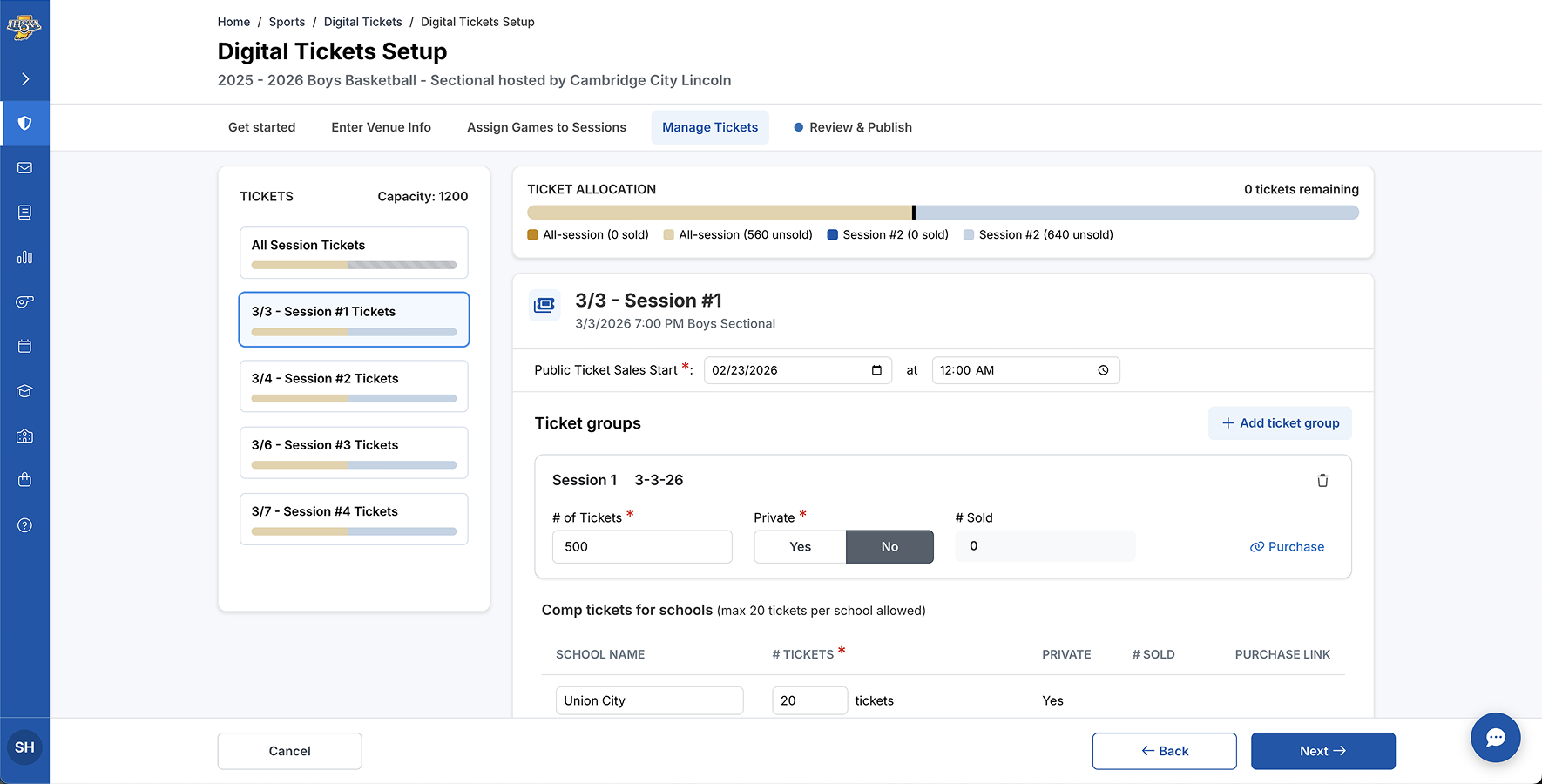
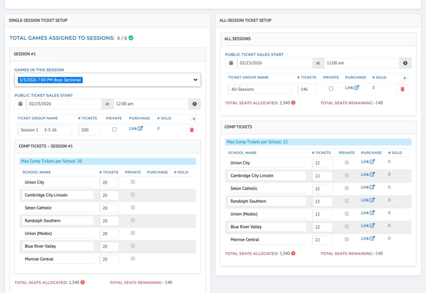
- Instead of dropping hosts onto one long form, the setup walks them through it in order: capacity first, since everything after depends on it, then games, tickets, and review.
- The capacity overview stays visible the whole time. The old page repeated the same “total seats allocated” number under every session, and it wasn’t obvious they were all one number. The bars also show how all-session tickets use up each session’s seats, because that math isn’t fun to do in your head.
- Publishing only happens on the review step, so hosts see everything before it goes live.
Before
After
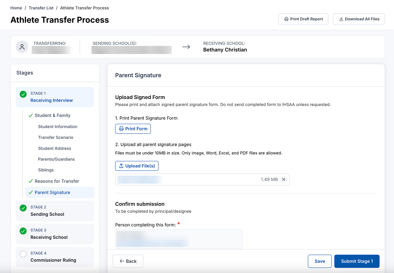
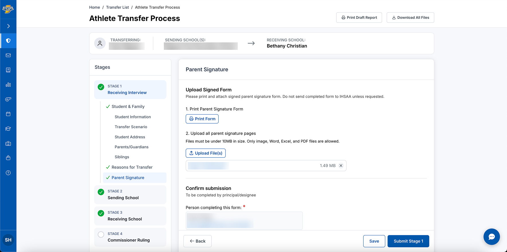
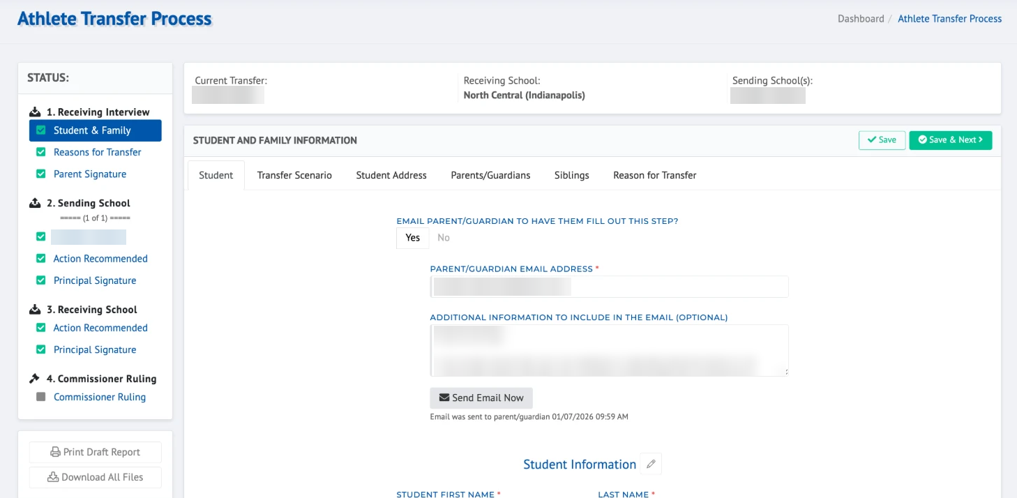
- The old tabs were confusing to navigate, because hitting Next jumped you to the next step instead of the next tab. Now every part of a step is listed under it in the stage list, so you can see where you are.
- Print and Download act on the whole transfer, so they moved to the upper right, where page actions belong.
- The old page had Save, Save & Next, and Save & Submit, and even I wasn’t sure which one to press. Now there’s one Save, and Submit only shows up at the end of the stage.
Where it landed.
IHSAA launched in July 2026. The client’s reaction was positive, and more importantly, the pages people actually use every day, the ones nobody could explain six months earlier, now have answers behind every button.
What worked.
- Extra design reviews with the devs, early and often
- Built-in revision sprints for the most complex, high-traffic features, so there was time to collect feedback from IHSAA staff
What I’d do differently.
No component documentation meant good patterns could travel to the wrong places, and no component audit meant we designed some screens from scratch that could’ve reused what already existed. Both are fixable with process, not more design time, which is why on my current project, I started with a documented design system before touching a single screen.
For IHSAA, I went back after launch and did a full audit, which is how I saw exactly where my patterns had traveled. I used Claude to help mold my pile of components, in design and in production, into one organized document, for future features and for whoever designs here next. Now that we’re building new features, I have more say in which components get used, instead of each developer making their own.