Colorchase
Using color to cross verbal boundaries
Colorchase gives nonverbal users a way to create and connect using color instead of language.
- Client
- Colorchase
- Role
- Primary designer, with one other designer
- Platform
- Consumer app, iPad
- Timeline
- 6 months
Meet Claire
Claire grew up the daughter of an artist, and color was always something she and her mom shared. When her mom was diagnosed with dementia and became nonverbal, the ways they used to connect started disappearing. Claire found that color and drawing could still reach her, glimmers of connection even after words were gone. Colorchase grew out of that.
Why not use existing drawing apps?
Claire had tried Adobe Fresco with her mom. Drawing apps like Fresco and Procreate are built for artists making their own work, not for two people sharing one page, and not for someone living with dementia.
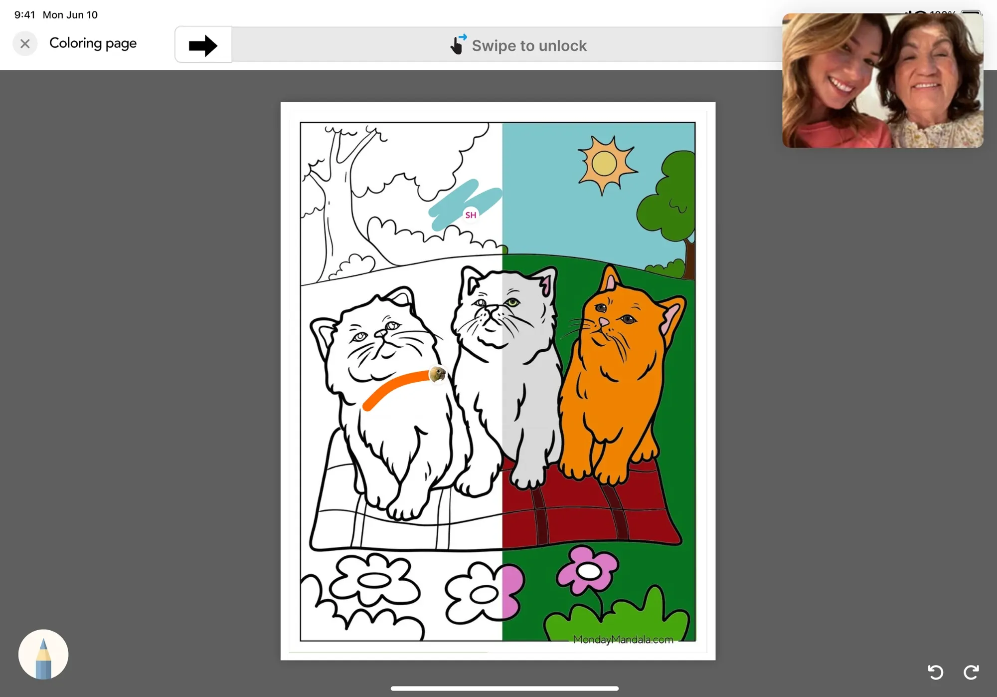
Colorchase needed to do what those apps don’t: let two people work on the same page, track activity in a way that gives caregivers meaningful insight into attention and engagement, and guide the activity instead of starting from a blank page. A blank page is overwhelming for a lot of people who don’t feel creative but still want to make something.
Designing a check-in that fit into the activity, not around it
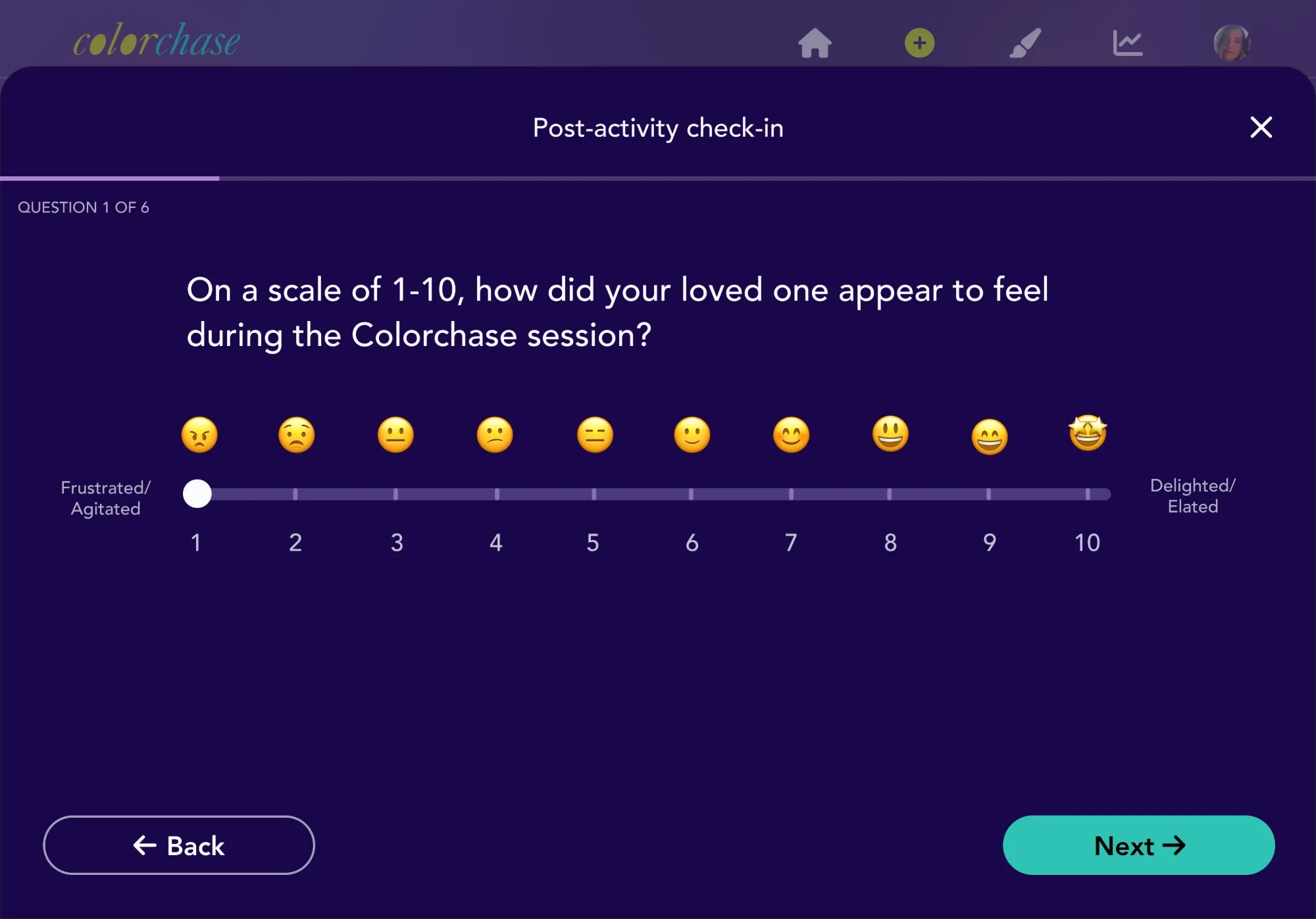
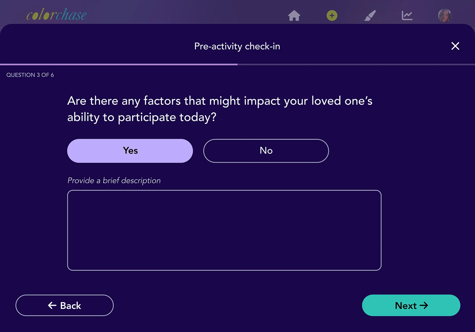
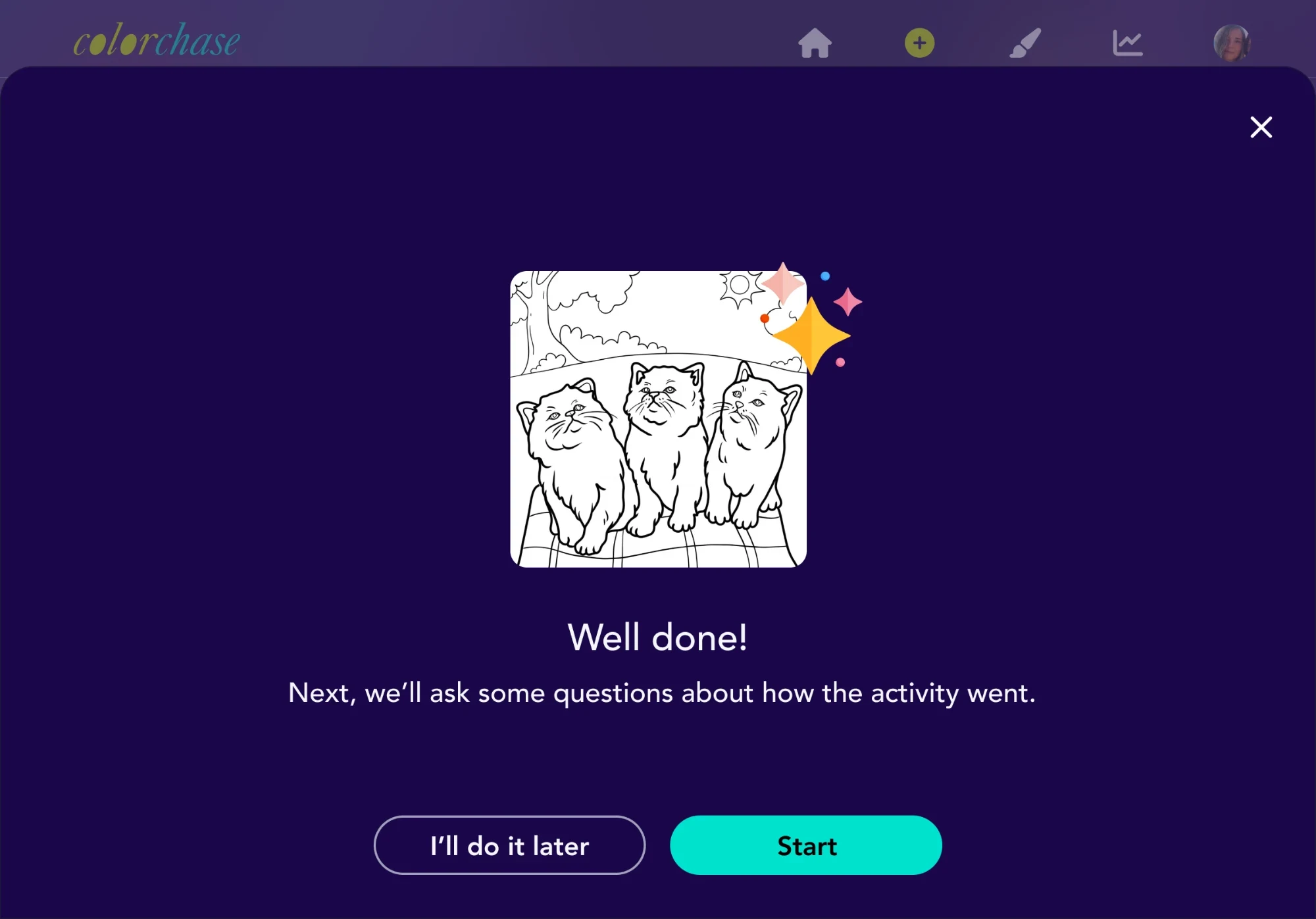
Real insight meant asking real questions, but turning an activity into a survey would defeat the point. The check-in happens in two short passes: a handful of questions before, a handful after, using emoji instead of text so answering takes seconds, not thought. A “describe more” field only shows up if there’s actually more to say. And the check-in doesn’t come first. You pick your activity and colors before you’re asked anything, so you’re walking in with some momentum instead of a form.
Designing for hands that might shake, or miss
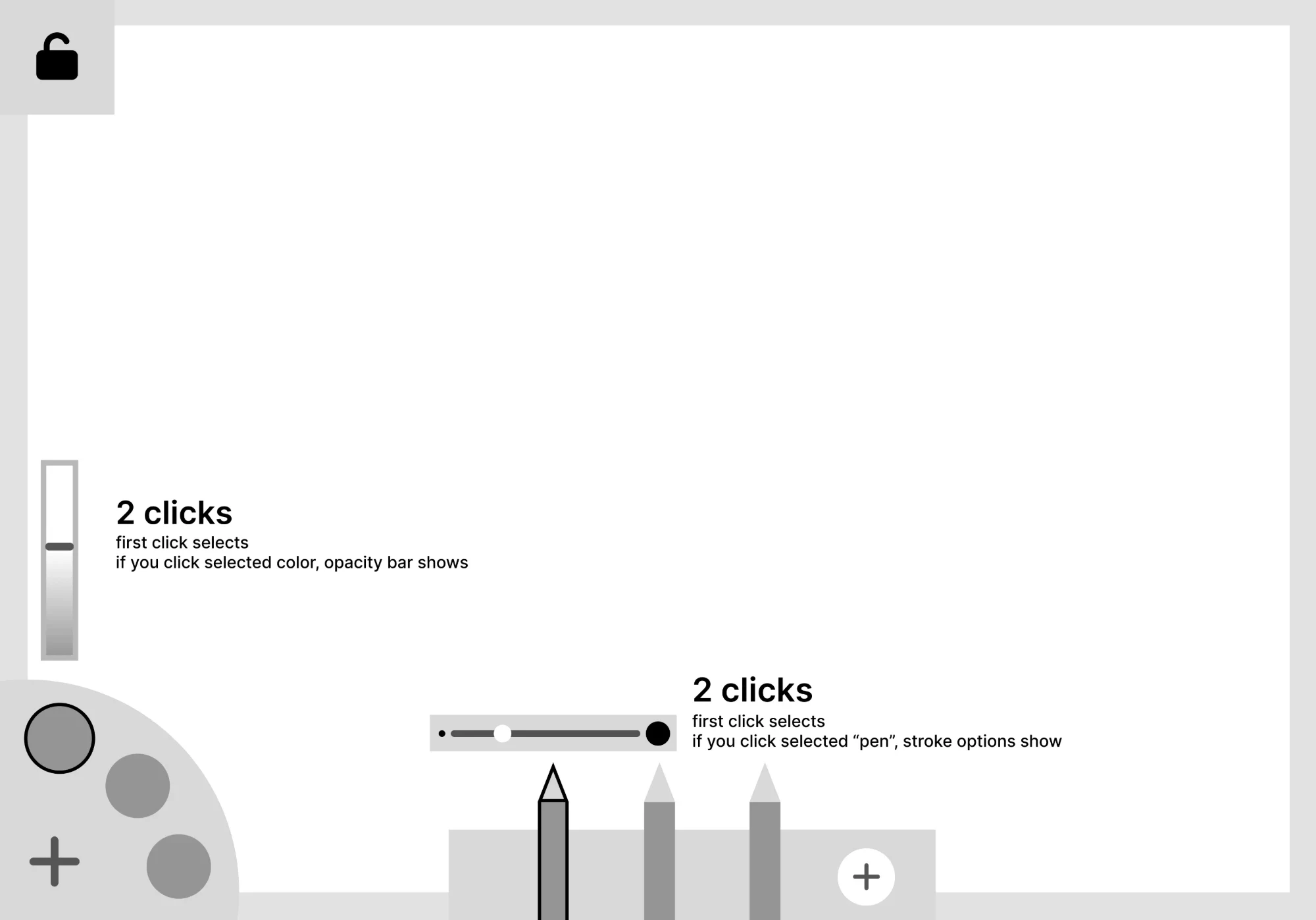
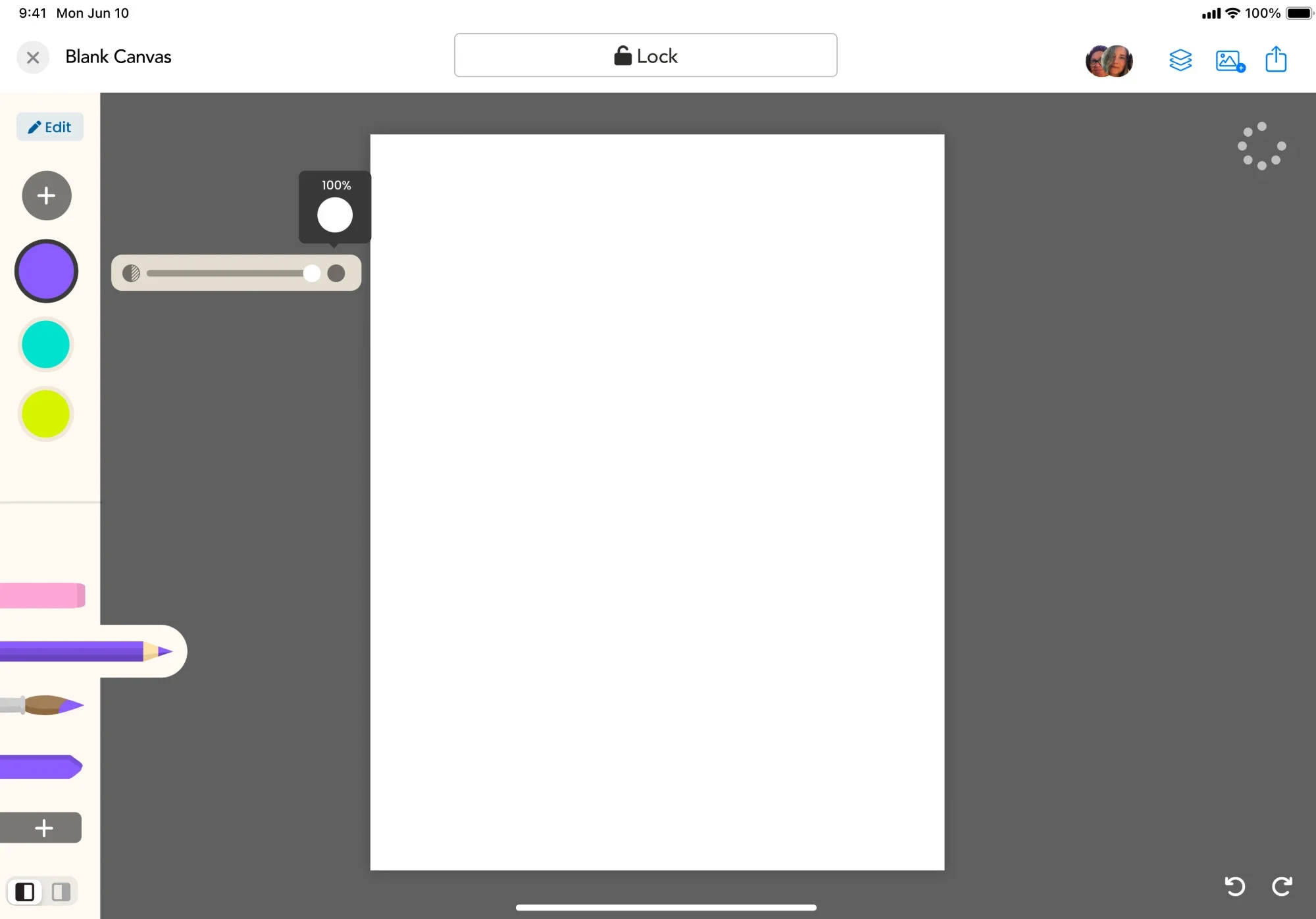
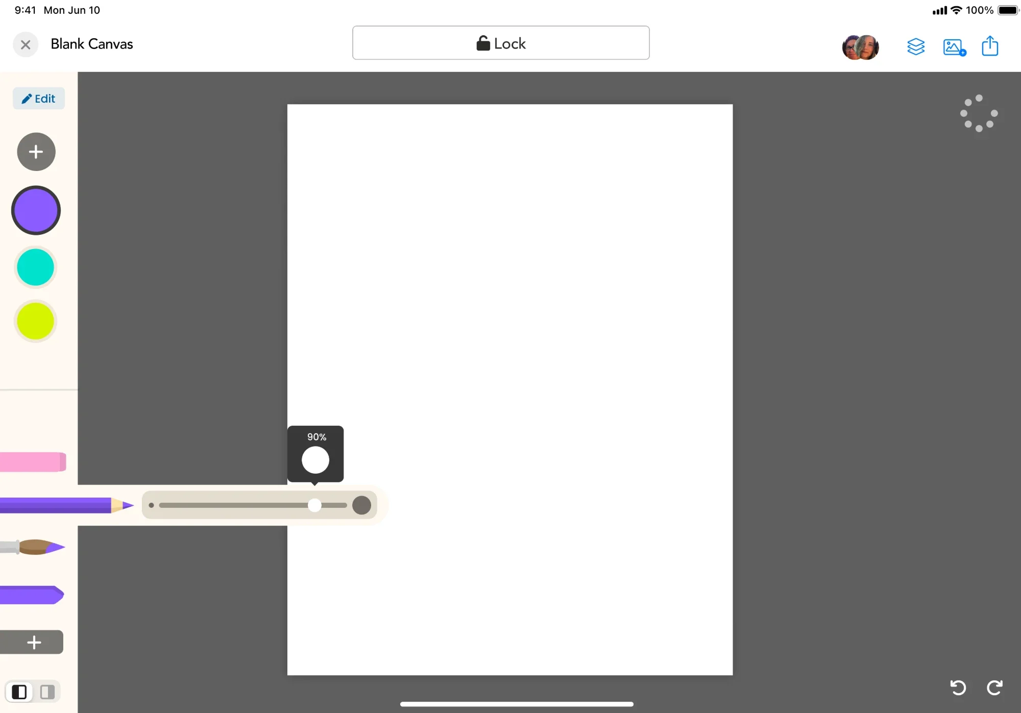
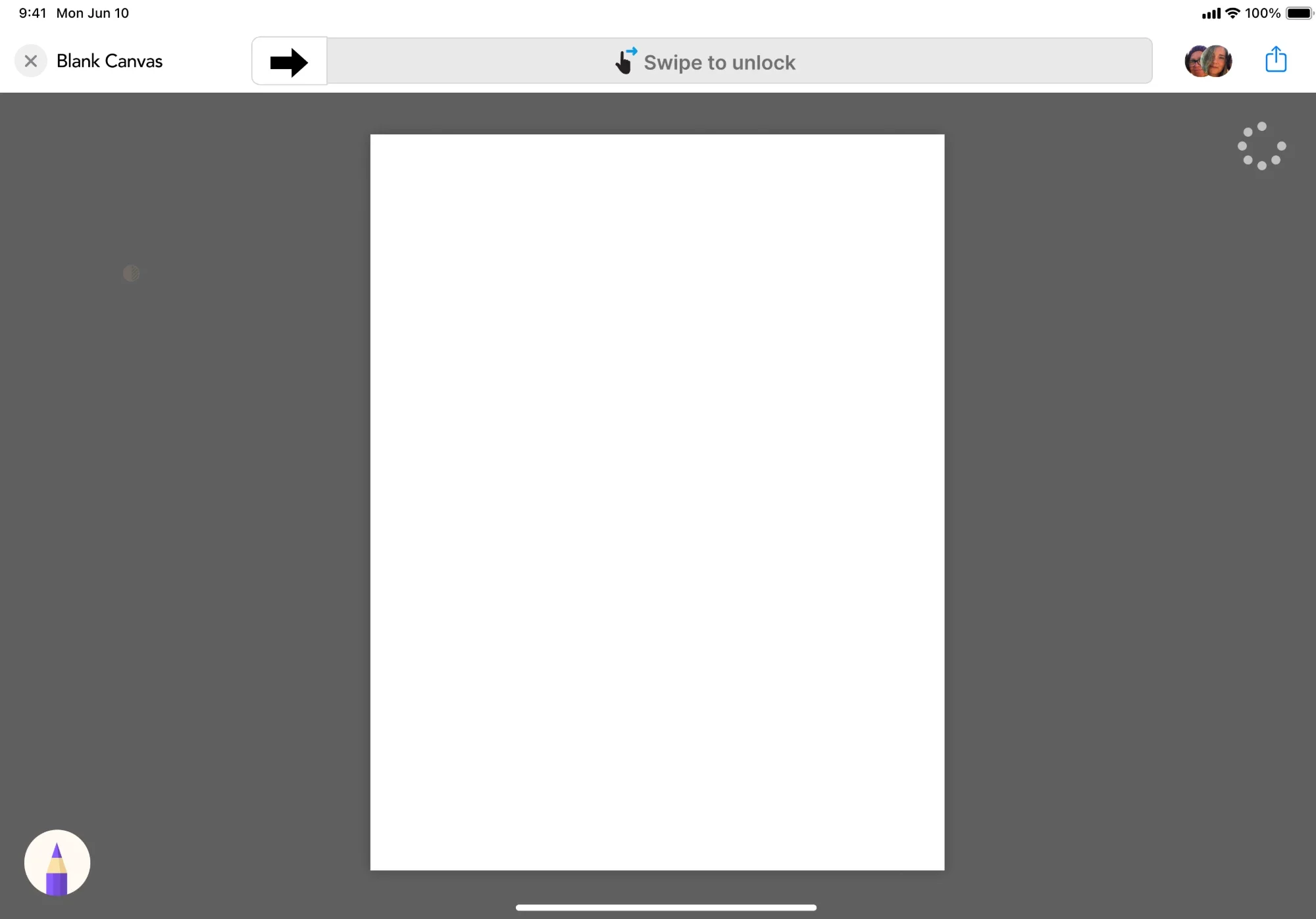
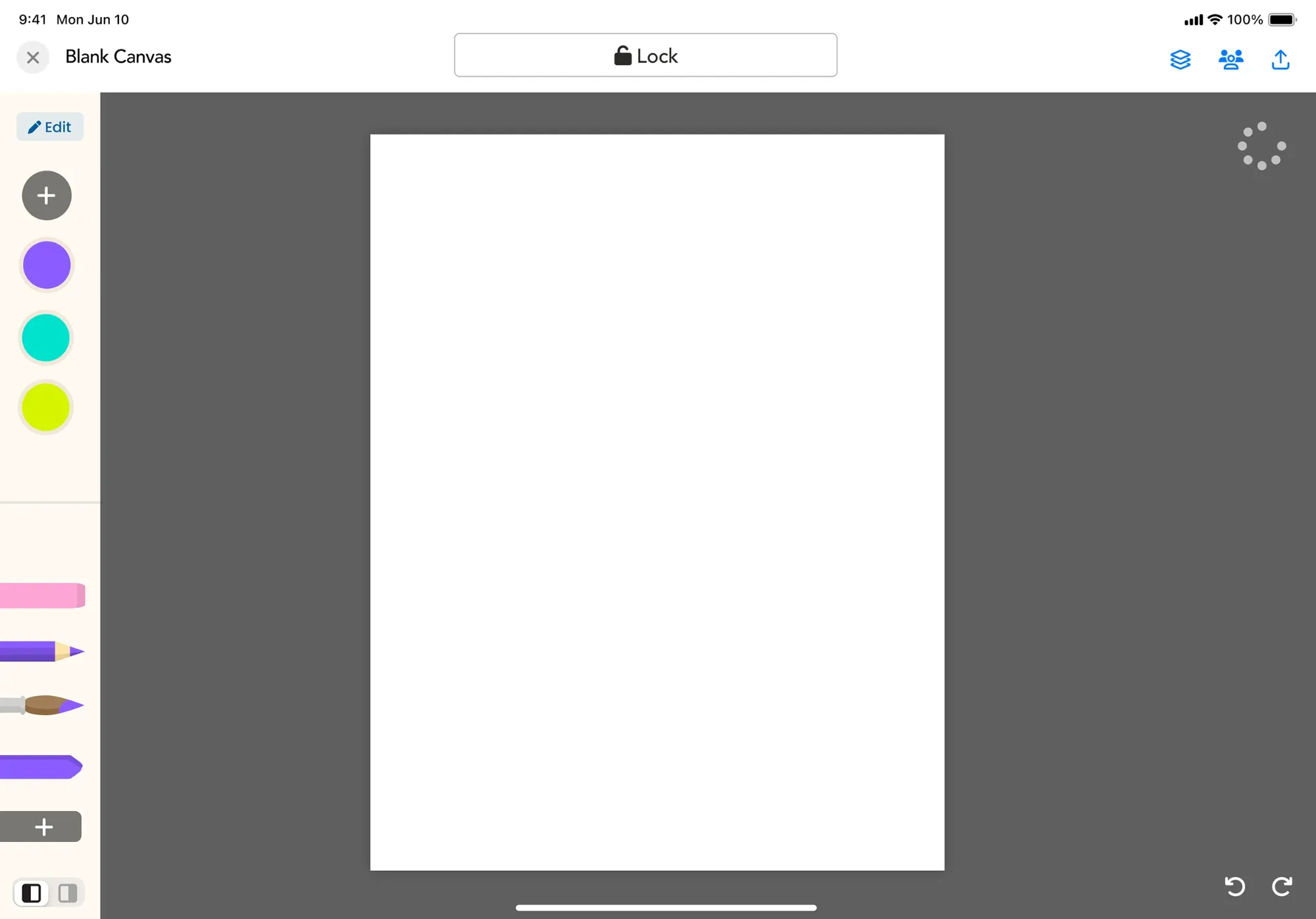
Larger touch targets, locked and unlocked tool states, and undo/redo always available, even knowing that “always available” also means undo can get tapped by accident. That tradeoff was worth it. Claire used undo constantly while coloring with her mom, nudging a stroke back, letting her mom’s hand lead while Claire shaped the result. She was closer to an art director than a co-colorist, and undo was the tool that made that possible.
“Sometimes my mom would grab the iPad or start doing a lot of movements that would cause the color to change, make unwanted strokes, or disrupt the coloring experience.”
Designing around a short attention span
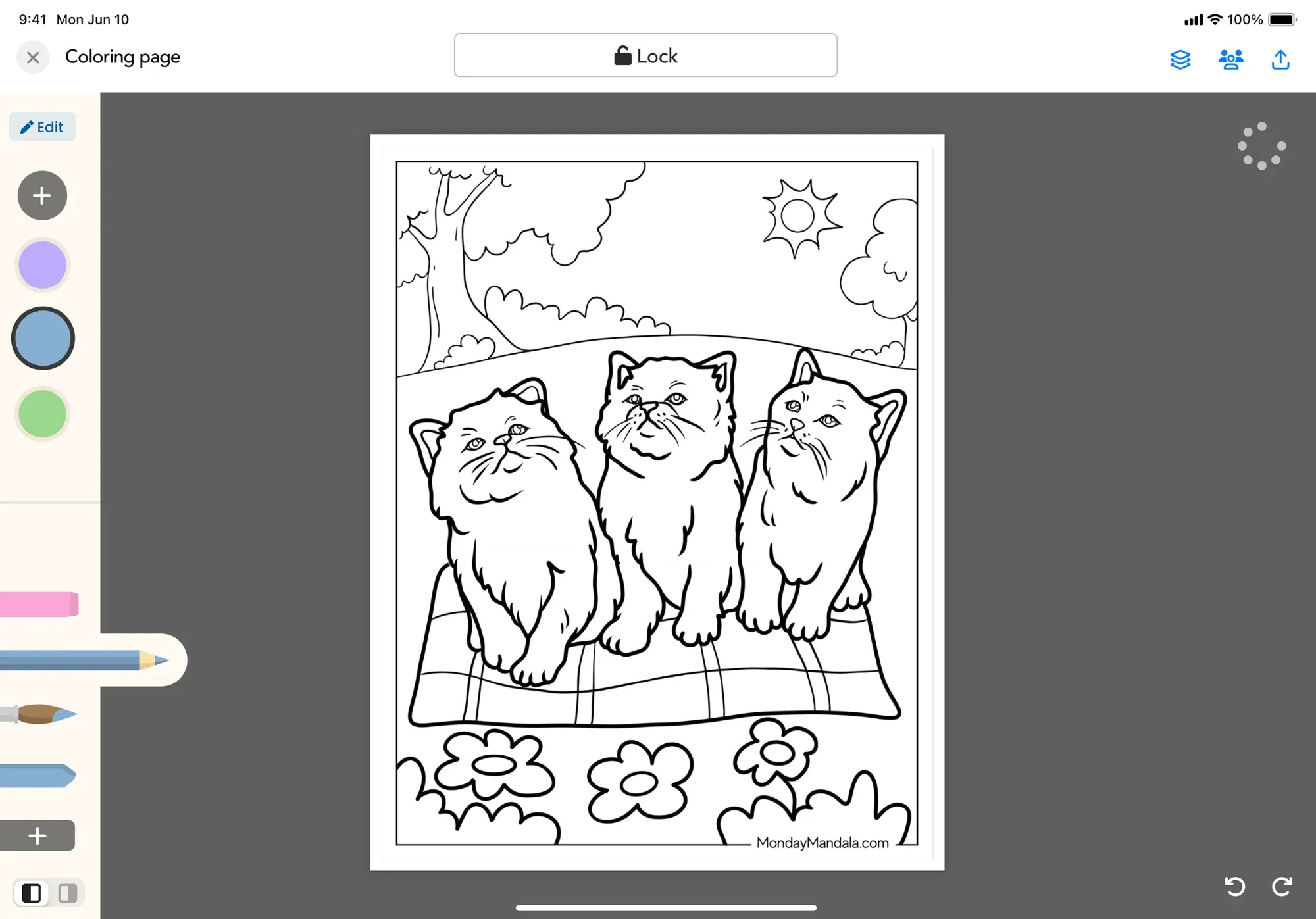
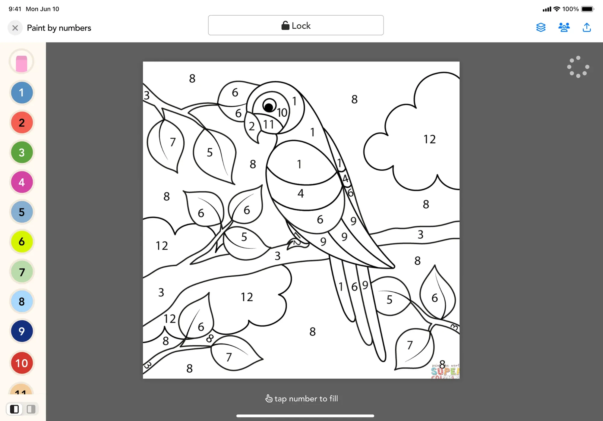
Not every session needs to be a finished piece. Someone can stop and pick back up later, or choose an activity that matches how much focus they have that day: freeform for open exploration, a coloring page for more structure, paint by numbers for the least amount of decision-making, or a photo they can color right on top of. Paint by numbers, in particular, exists so two people can focus on doing something together instead of getting stuck deciding what color goes where.
Showing progress
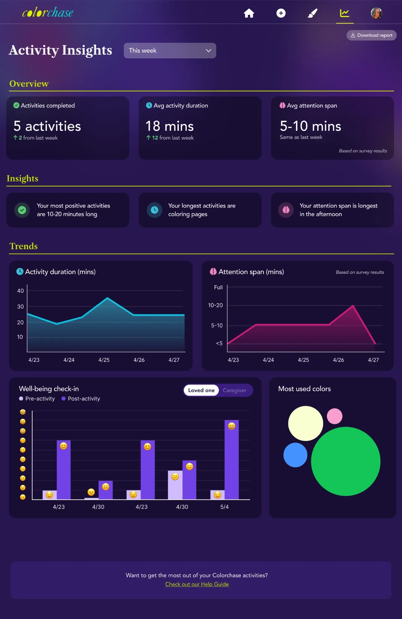
The dashboard’s wording was deliberately kept positive or neutral, never framed as decline. Even if someone’s attention span had dropped from 20 minutes to 5, the insight reads as “your attention span is longest in the afternoon,” not “attention span is decreasing.” A caregiver watching a loved one change is already carrying a lot; the data didn’t need to underline what’s being lost. It could just point toward what still works.
What happens to what you make
A finished piece doesn’t just disappear when the activity ends. It can be framed, saved to a gallery that builds up over time, and turned into data caregivers can actually use: attention span, mood before and after, which colors get reached for most. Down the line, we’ve talked about letting people order prints, so a piece made together doesn’t just live on a screen.
What this means for Claire, and where it’s going
Claire built this because she found a way back to her mom after words stopped working, and realized other families were looking for the same bridge. Colorchase turns that into something repeatable: an activity, a connection, a small piece of art that says something didn’t have to be spoken to be real. Right now, Claire’s in conversations with hospitals and caregivers, gathering feedback and pitching the next stage: an enterprise version built for care settings, not just individual families.